Big Keyboard: Easy Homescreen
- 4.4
- Rating
- 1.00M
- Installs
- Free
- Price

 Analysis by App-foxy
I usually notice a home-screen app only when it gets in my way. After spending time with Big Keyboard: Easy Homescreen, I found its appeal much more practical than decorative: it tries to make everyday phone actions easier to see, easier to tap, and less dependent on tiny interface elements. That makes it especially interesting for people who struggle with small keys, crowded layouts, or the usual hunt through several pages of icons.
This is a free personalization app from SwipeTap Apps, intended for everyone and available on devices running Android 12 or later. It has already passed the one-million-install mark, with an average rating of 4.5 from roughly twenty-six thousand ratings and around twenty-seven hundred written reviews. Those figures suggest that the idea is reaching a real audience, but they do not remove the need to check whether its simplified approach fits the way you use your phone.
What using the simplified home screen feels like
The central change is a shift away from a conventional launcher experience toward a more readable starting point. Instead of treating the home screen as a place for tiny icons, visual decoration, and several layers of navigation, the app focuses on prominent controls, a large keyboard, and search that is meant to get you to an app or action quickly.
You May Also Like

 Blood Strike: 2.5 Anniversary
Blood Strike’s Loadouts Turn Every Drop Into a Tactical Gamble
A close look at Blood Strike’s custom loadouts: how fast access to signature weapons reshapes its battle royale rhythm, rewards preparation, and narrows the gap between fights.

 Pandora - Music & Podcasts
Pandora’s Music Is Easy to Start, but Harder to Recover
Pandora’s strength is its low-effort path from a seed to a station. Its weak spot is how much confidence it asks you to place in connection, setup, and quiet recovery.

 8 Ball Pool
 Is Built on Rivalries, Rematches, and Routine
A close look at the rivalries, rematches, shared routines, and unanswered safety questions that turn a quick pool match into a persistent mobile community.

 Samsung Music
’s Quiet Strength Is Playing What You Already Own
Its reach comes less from spectacle than from dependable access to a personal library. That simplicity is both the app’s strongest retention engine and its ceiling.

 AccuWeather: Weather Radar
AccuWeather Review: A Quick, Clear Forecast for Everyday Decisions
For everyday plans, the best forecast is the one you can understand quickly. AccuWeather makes rain timing, radar, and local conditions easy to act on, with a few trade-offs.

 Hill Climb Racing
Why Hill Climb Racing Still Turns Crashes Into One More Run
A tiny car, a bumpy hill and one more upgrade: Hill Climb Racing keeps resurfacing because its simple chaos makes every near-miss feel personal.
More From Our News Desk



That sounds simple, but simplicity changes your habits. With a standard home screen, I often swipe, scan, and then swipe again because I cannot immediately remember where an app sits. A large, search-oriented layout reduces that memory burden. I can think of the app or contact I want instead of remembering its exact position.
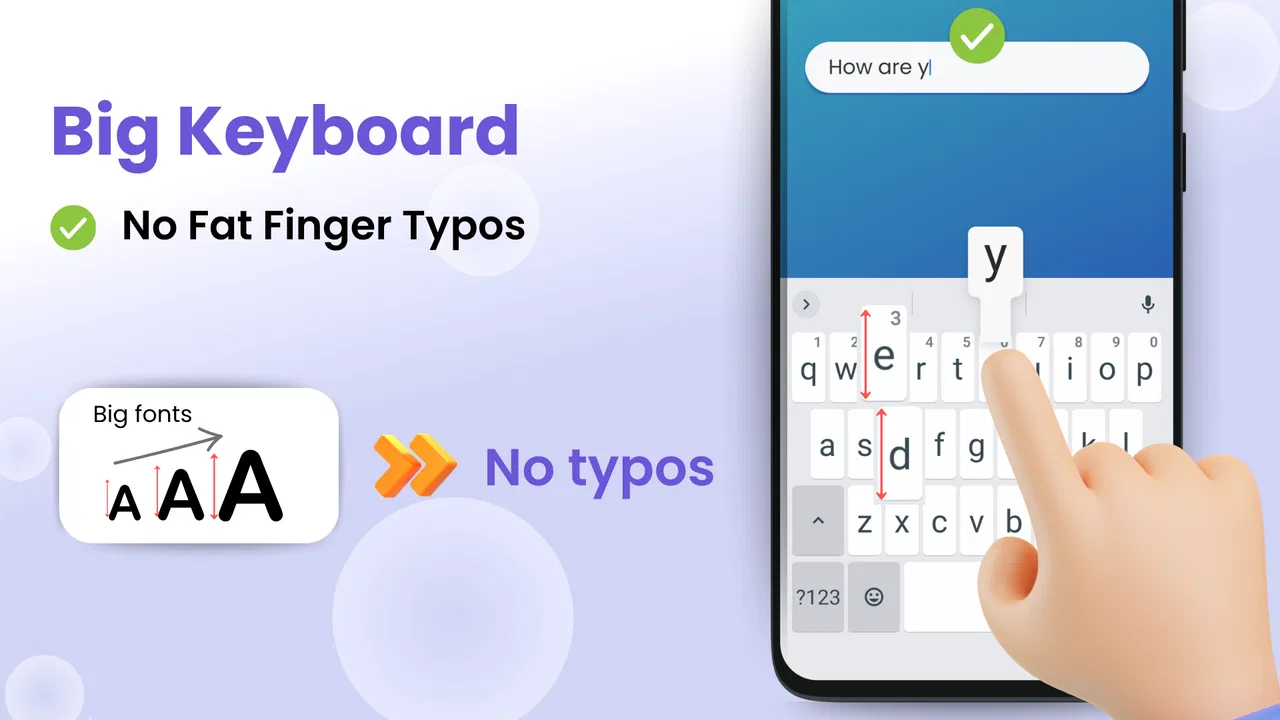
The big keyboard is the most important part for anyone who finds ordinary phone keys uncomfortable. Larger touch targets can make typing less tense, particularly when entering a short search or composing something while walking between tasks. It is not a replacement for every keyboard preference, though. People who type quickly on compact layouts may initially feel that the larger arrangement uses more screen space than necessary.
I also see a useful distinction between this app and a traditional visual launcher. Many launchers concentrate on themes, icon packs, gestures, widgets, and fine-grained layout control. Big Keyboard: Easy Homescreen is aimed at reducing decisions rather than adding them. If you want a phone that feels calmer and more direct, that restraint is a strength. If you enjoy designing every part of your home screen, it may feel too limited.
Who benefits most from the design
The clearest audience is someone who has difficulty reading small labels or accurately hitting small buttons. That can include older users, people with reduced vision, users with less precise touch control, or anyone who simply dislikes dense interfaces. It can also help a family member who wants a phone that exposes the most important actions without requiring a lesson in launcher organization.
A realistic example is a person who checks messages, opens the camera, and searches for one or two frequently used apps several times a day. On a conventional setup, those actions may involve finding a small icon among many others. Here, the larger presentation and search-first approach can make the routine more predictable. The value is not that the phone suddenly does more; it is that familiar tasks demand less visual sorting.
I would be more cautious about recommending it to a power user who relies on multiple widgets, tightly arranged folders, gesture shortcuts, or a highly customized icon grid. Those people may find the simplified home screen gets between them and the setup they have already optimized. The app makes a deliberate trade-off: less clutter and less searching in exchange for less traditional launcher freedom.
Small workflow changes that make it more useful
One useful way to approach the app is to treat search as the main route rather than an emergency backup. Instead of repeatedly rebuilding the home screen around every app you might need, keep the visible layout focused on the actions you use most and use the large keyboard for everything else. This reduces the temptation to create a crowded first page.
A second practical tip is to test the layout during the moments when you normally make mistakes. Try opening the camera with one hand, searching while wearing glasses, or finding an infrequently used app when you are in a hurry. A launcher can look comfortable during a calm setup session but feel different when your attention is divided. Those tests tell you more than appearance alone.
There is also a trade-off between visibility and privacy in shared spaces. Larger labels and obvious search interaction are helpful when you are the person using the phone, but they can make the screen easier for someone nearby to read. I would avoid searching for sensitive names or private topics in public unless I was comfortable with the display being visible. That is not a claim about the app collecting anything; it is simply a consequence of making information easier to see.
Trust starts with visible choices
For a home-screen replacement, trust matters because the app sits close to some of the most frequent actions on a phone. I look for clear, understandable choices during setup and ordinary use: whether I can continue without creating an account, whether the app explains what it needs, and whether I can return to my previous home-screen arrangement without unnecessary friction.
My approach with this app is deliberately cautious. I would read every setup prompt rather than tapping through automatically, especially if the system asks to make it the default home app or requests access connected to search, contacts, notifications, or other phone functions. A simplified interface should not encourage blind approval. The useful question is always whether a requested permission matches an action I actually want to use.
The app is free, which removes a purchase decision but does not make privacy questions irrelevant. Free apps can still present choices around permissions, personalization, or account features. I would check the wording on the device at installation and revisit the app’s settings if I later change how I use it. The important point is to judge only what is visibly explained, not to assume either excellent or poor data practices without evidence.
I also prefer testing it first on a phone where I know how to restore the previous launcher. Before making it the permanent default, I would note the current home-screen arrangement and confirm how to switch back through Android settings. That is a sensible precaution with any launcher, and it gives you a low-risk way to evaluate the app’s readability and controls.
Permissions, accounts, and control in daily use
Because the app’s role is so close to navigation and typing, the most important user-control question is not whether it looks friendly but whether its choices remain understandable after setup. I would look for settings that let me decide what appears prominently, how search behaves, and whether optional elements can be ignored. Clear controls are more valuable here than a long list of customization options.
I would also separate two kinds of information: what the app displays on the screen and what the app may process behind that interaction. Seeing an app name in a search result does not, by itself, tell me how search data is handled. For sensitive use, I would avoid entering private terms until I had reviewed the relevant explanations and system prompts. That habit protects my agency without making unsupported assumptions about the developer.
Account control is another area where I would pay attention. If a setup screen offers sign-in, I would ask whether signing in is genuinely needed for the basic home-screen experience. If it is optional, I would begin without it and see whether the core layout remains useful. If an account becomes necessary for a particular feature, I would decide whether that feature is worth the additional commitment rather than accepting it automatically.
These checks may sound less exciting than discussing colors or icon placement, but they fit this app especially well. A launcher becomes part of the phone’s daily rhythm. The more often I use a tool, the more I want its prompts, permissions, and exit routes to be easy to understand. A large keyboard helps my fingers; clear choices help me stay in control.
Where the simplified approach can frustrate
The same design that helps someone find an app can feel repetitive to someone who already knows exactly where everything is. If you prefer a compact grid, the larger presentation may make you feel that fewer items fit within reach. Search is efficient when you remember the name of what you want, but it is less helpful when you are browsing visually or choosing between several similar apps.
There is also a learning curve when switching from a familiar launcher. Even a simpler home screen changes muscle memory. I would give it enough time to cover several normal routines before deciding whether it is right for me. The first few minutes mainly reveal what feels unfamiliar; a full day reveals whether the larger controls actually reduce mistakes.
Users who depend on a particular keyboard may need to compare the app’s large-key approach with their existing typing habits. A bigger keyboard can improve accuracy for some people, while others may miss a compact layout, specialized shortcuts, or a familiar prediction system. I would not switch solely because “big” sounds better; I would test common tasks such as searching, entering names, and typing short messages.
Another limitation is that a simplified interface cannot solve every accessibility issue. Display scaling, system accessibility settings, contrast preferences, and touch responsiveness still matter. Someone with very specific accessibility requirements should consider the app as one layer of the solution, not as a complete replacement for Android’s own tools. Its strongest benefit is straightforward access, not a promise to cover every need.
How it compares with ordinary launchers
A normal Android launcher is usually the better choice for customization. It tends to suit people who want widgets, multiple pages, folders, visual themes, and a layout that reflects a personal workflow. It also preserves the familiar relationship between an icon and a fixed location, which can be faster for experienced users.
Big Keyboard: Easy Homescreen makes more sense when the problem is not a lack of options but too many of them. Its large controls and search-centered behavior can reduce the visual effort involved in locating an app. In my view, it is closer to a clarity tool than a style tool. That difference is important: I would choose it for ease of access, not for an endless customization project.
I would also consider who else uses the phone. A standard launcher may be easier if several people share the device and already understand Android’s usual layout. A simplified setup may be better for one primary user who wants consistency and does not want to explain folders, pages, or tiny icons. In a family setting, I would let the actual user test it rather than choosing on their behalf.
Version, compatibility, and the setup decision
The current version is 1.1.36, and the app requires Android 12 or newer. That requirement is worth checking before planning a switch, especially if you are setting up an older spare phone for a relative. On a compatible device, I would install it, inspect the first-run choices carefully, and try it as the default only after confirming how to return to the previous launcher.
Since it is free and rated for everyone, it is easy to approach as a low-cost experiment. Still, the real cost is measured in adjustment time. I would not migrate a complicated work phone immediately. A better workflow is to test the app on the device you use for ordinary calls, searches, and camera access, then decide whether the reduced clutter outweighs any lost habits.
Before committing, I would make a short checklist: Can I find my essential apps without hesitation? Can I type accurately on the larger keyboard? Do the setup prompts make sense? Can I identify and change the default-home setting? Can I return to my old arrangement if the experience is not suitable? These questions turn a vague impression into a practical decision.
My recommendation after weighing convenience and control
Big Keyboard: Easy Homescreen is a focused option for people who want their phone to feel less crowded and more readable. I like that its purpose is easy to understand: make the starting point more approachable, provide larger typing targets, and reduce the need to remember where every app lives. For the right user, that can remove a surprisingly large amount of daily friction.
My recommendation comes with a clear condition: use it when accessibility and simplicity matter more than deep customization. If you want an elaborate launcher, compact information density, or a carefully tuned widget system, a conventional alternative will probably serve you better. If small icons and cramped keys are the problem, this app is worth testing because its design addresses that problem directly.
I would also keep trust practical. Read the setup screens, review any requested access, avoid entering sensitive searches until you understand the visible choices, and make sure you know how to change the default launcher. Those steps do not undermine the app; they are what responsible testing looks like for any tool placed at the center of your phone.
Overall, I see Big Keyboard: Easy Homescreen as a useful accessibility-minded home-screen app rather than a universal replacement for Android’s usual launcher. Its best quality is the way it removes visual and touch-related obstacles without asking the user to become a launcher expert. Its main weakness is the same simplicity: users who want control, density, or advanced personalization may feel constrained. For someone who wants a clearer, calmer phone and is willing to trade customization for easier everyday access, I would recommend giving it a careful trial.
FAQs for Big Keyboard: Easy Homescreen
01What features does Big Keyboard: Easy Homescreen offer?
Big Keyboard: Easy Homescreen provides a user-friendly interface with larger keys, making typing easier for users with visual impairments or those who prefer a more accessible keyboard. It includes customizable themes, predictive text, and voice typing features, enhancing the overall user experience.
02Is Big Keyboard: Easy Homescreen compatible with all devices?
Big Keyboard: Easy Homescreen is compatible with most Android and iOS devices. However, it's essential to check the specific requirements on the app's download page to ensure compatibility with your device's operating system and version before installing.
03Does Big Keyboard: Easy Homescreen offer privacy and security features?
Yes, Big Keyboard: Easy Homescreen prioritizes user privacy by not collecting personal data without consent. It includes options to manage and customize privacy settings, ensuring that users have control over what information is shared and stored while using the app.
04Can I customize the appearance of Big Keyboard: Easy Homescreen?
Absolutely! Big Keyboard: Easy Homescreen offers a variety of customization options, allowing users to change themes, colors, and font sizes. This flexibility ensures that users can tailor the keyboard's appearance to suit their personal preferences and enhance visibility.
05Is Big Keyboard: Easy Homescreen suitable for all age groups?
Yes, Big Keyboard: Easy Homescreen is designed to be intuitive and easy to use, making it suitable for users of all ages. Its larger keys and straightforward interface are particularly beneficial for children and seniors who might find standard keyboards challenging to navigate.
Pros
- Large keys improve typing accuracy.
- Customizable themes enhance user experience.
- Easy setup with intuitive interface.
- Supports multiple languages.
- Quick access to frequently used emojis.
Cons
- Might occupy more screen space.
- Limited customization for key shapes.
- Ads can be intrusive for some users.
- May lag on older devices.
- No option for gesture typing.

Big Keyboard: Easy Homescreen
Gallery